In this post, we will learn how to create an animated icon using built-in AnimatedIcon widget and AnimatedIcons in Flutter framework. Here is the result we will get after this lesson:
1. Create empty screen
import 'package:flutter/material.dart';

void main() => runApp(AnimatedIconDemo());

class AnimatedIconDemo extends StatelessWidget {
  @override
  Widget build(BuildContext context) {
    return MaterialApp(
      title: 'Coflutter - AnimatedIcon ',
      home: Scaffold(
        appBar: AppBar(
          title: const Text('Coflutter - AnimatedIcon'),
          backgroundColor: const Color(0xffae00f0),
        ),
        body: AnimatedIconDemoScreen(),
      ),
    );
  }
}

class AnimatedIconDemoScreen extends StatefulWidget {
  @override
  _AnimatedIconDemoScreenState createState() =>
                 _AnimatedIconDemoScreenState();
}

class _AnimatedIconDemoScreenState extends
State<AnimatedIconDemoScreen> {

  @override
  Widget build(BuildContext context) {
    return Container();
  }
}
Above class simply creates an empty screen with an app bar “Coflutter – AnimatedIcon”
2. Prepare and build AnimatedIcon
AnimatedIcon widget requires 2 properties and a few other optional properties:
- (Required) AnimatedIconData icon: the icon to display. Currently there are pre-defined list of icons we can use.
- (Required) Animation<double> progress: the animation progress for the animated icon.
- (Optional) color: the color of the icon.
- (Optional) size: the size of the icon.
Therefore, our animated icon will look like this:
AnimatedIcon(
    size: 100,
    color: Colors.blue,
    icon: AnimatedIcons.close_menu,
    progress: _animationController,
)

// With

_animationController =
        AnimationController(vsync: this,
        duration: Duration(milliseconds: 500));
Let’s update our code (from step 1) by adding AnimatedIcon to screen:
// ... Keep other old code

// Update _AnimatedIconDemoScreenState class
class _AnimatedIconDemoScreenState
    extends State<AnimatedIconDemoScreen>
    // New: Ticker for animation
    with SingleTickerProviderStateMixin {

  // New
  AnimationController _animationController;

  // New: Initialize animation controller
  @override
  void initState() {
    super.initState();

    // Create controller
    _animationController =
        AnimationController(vsync: this,
        duration: Duration(milliseconds: 500));
  }

  // New: Release controller
  @override
  void dispose() {
    _animationController.dispose();
    super.dispose();
  }

  @override
  Widget build(BuildContext context) {
    // New: Add animated icon at the center of screen
    return Center(
      child: AnimatedIcon(
        size: 100,
        color: Colors.blue,
        icon: AnimatedIcons.close_menu,
        progress: _animationController,
      ),
    );
  }
}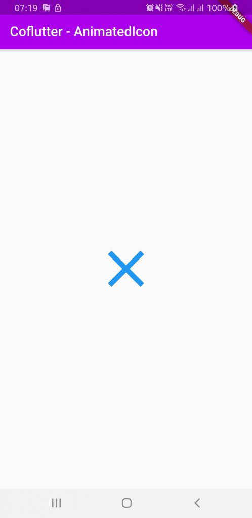
At this point we only see the icon at the center of screen, we can not test or see any “animated” part. Let’s move to next step to add the animation when tapping on the icon.
3. Add animation
Here we wrap the icon by an InkWell widget and handle onTap event, combine with a bool variable to know current state of the icon:
class _AnimatedIconDemoScreenState extends
          State<AnimatedIconDemoScreen>
          with SingleTickerProviderStateMixin {
  AnimationController _animationController;
  // New: icon states: show menu vs. show close.
  bool isShowingMenu = false;

  @override
  void initState() {
    super.initState();

    _animationController =
        AnimationController(vsync: this,
          duration: Duration(milliseconds: 500));
  }

  @override
  void dispose() {
    _animationController.dispose();
    super.dispose();
  }

  @override
  Widget build(BuildContext context) {
    return Center(
      // New: Wrap icon to handle onTap event
      child: InkWell(
        child: AnimatedIcon(
          size: 100,
          color: Colors.blue,
          icon: AnimatedIcons.close_menu,
          progress: _animationController,
        ),
        // New: handle onTap event
        onTap: () {
          // Update the state
          isShowingMenu = !isShowingMenu;
          if (isShowingMenu) {
            // Trigger animation (start: close -> menu)
            _animationController.forward();
          } else {
            // Trigger animation (revert: menu -> close)
            _animationController.reverse();
          }
        },
      ),
    );
  }
}
That’s it!
Here is full source code in case you want to copy and run:
import 'package:flutter/material.dart';

void main() => runApp(AnimatedIconDemo());

class AnimatedIconDemo extends StatelessWidget {
  @override
  Widget build(BuildContext context) {
    return MaterialApp(
      title: 'Coflutter - AnimatedIcon ',
      home: Scaffold(
        appBar: AppBar(
          title: const Text('Coflutter - AnimatedIcon'),
          backgroundColor: const Color(0xffae00f0),
        ),
        body: AnimatedIconDemoScreen(),
      ),
    );
  }
}

class AnimatedIconDemoScreen extends StatefulWidget {
  @override
  _AnimatedIconDemoScreenState createState() => _AnimatedIconDemoScreenState();
}

class _AnimatedIconDemoScreenState extends
State<AnimatedIconDemoScreen>
    with SingleTickerProviderStateMixin {
  AnimationController _animationController;
  // New: icon states: show menu vs. show close.
  bool isShowingMenu = false;

  @override
  void initState() {
    super.initState();

    _animationController =
        AnimationController(vsync: this,
            duration: Duration(milliseconds: 500));
  }

  @override
  void dispose() {
    _animationController.dispose();
    super.dispose();
  }

  @override
  Widget build(BuildContext context) {
    return Center(
      // New: Wrap icon to handle onTap event
      child: InkWell(
        child: AnimatedIcon(
          size: 100,
          color: Colors.blue,
          icon: AnimatedIcons.close_menu,
          progress: _animationController,
        ),
        // New: handle onTap event
        onTap: () {
          // Update the state
          isShowingMenu = !isShowingMenu;
          if (isShowingMenu) {
            // Trigger animation (start: close -> menu)
            _animationController.forward();
          } else {
            // Trigger animation (revert: menu -> close)
            _animationController.reverse();
          }
        },
      ),
    );
  }
}
You can find similar article about Animated Container here: Flutter – Animation with AnimatedContainer
If you are looking for mobile/web Software Engineers to build you next projects, please Drop us your request!

Creator of Coflutter.
Founder & CTO at Bumbii Technology
Founder at Bumbii K12
Follow him on Twitter, Github, StackOverflow, LinkedIn, Upwork.